1st semester projects
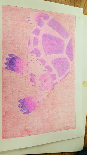
Mostly warm colors are found here and I would describe them to be pink and purple. The subject is not centered in the page which is sought after and fills up the majority of the page. Since I used colored pencil, you can see the pencil strokes in the background for example. This piece is simply my tortoise and drawing him more often gives me practice to make the work more realistic and accurate. The piece feels warm and calm, showing no real dark colors and no dramatic pose. For the colors and medium, I feel if I had chose a different color to blend the front feet, a color less harsh, the piece would look better. The back foot is blended nicely and is what I was striving for. The medium of colored pencil is what I am most comfortable with and I feel that the design of the shell is blended well. Since I own this work, I am going to save it to look back and see how I progressed. Form, color, and shape are used in this work. Principles of design are proportion and variety because the proportions of the subject are accurate and colors are varied. Overall I am pleased with this work and I am glad I did another piece of my tortoise because it shows how much progress I have made since last year.
Master artist: Jeff Koons
Contemp: Melissa Schlobohm
This piece is the "favorite memory of Lakewood Ranch" and I chose to do my project on JROTC because I feel people only see a small portion of what the program is and what we do in it. In this project, I drew myself wearing my hoodie representing the program with kids playing soccer in the background. I wanted to show the less professional and lay back side of the program, where we have the chance to act like ourselves and have fun with one another. The work feels light and inviting and the colors used helps show a sense of fun. Color, line and shape are elements used and principles of design are balance and unity. I would change how I drew the background people if I were to redo the work.
Master: Johannes Vermeer
Contemp: David Walker
I chose to do the cut paper project on a cat playing with a butterfly because I felt it would turn out cute. I feel like if I added more detail to the cat, sky and butterfly the overall look would improve. I like how I layered the grass and head of the cat to create a 3D effect. I added clouds last minute but if I were to add more detail there too it would help. I like how you can still see the details of the cat in pencil. Color and form are elements used such as the contrast of the warm colored butterfly and the cool colored sky and grass. Principles of design are balance and proportion because the cat and butterfly balance out on the paper and the butterfly is bigger to create the illusion it is closer to the viewer.
Master: Diane McClary
Contemp: David Hockney
This is the half project, now finished that was assigned at the end of first quarter. I chose to do a witch because the time was around Halloween. The mediums I used were colored pencil, paint and gel pen for the stars. The work feels fun and mischievous, like the girl is having fun with someone. I like how I drew the girl but I do not like the color of the sky, I was going for a darker navy but the paint I used did not match my intentions. I wish I could have used the gel pen to create constellations with the stars instead of random stars. Elements like color and shape are used and principles of design are movement and proportion.
Master: Vincent Van Gogh
Contemp: Edvard Munch
This piece is from one of my favorite movies, How To Train Your Dragon of Astrid and her dragon. I like how I drew her overall, but I wish I had drawn the dragon in a different style because I feel the two do not match in style. I am pleased with the colors I used and the details are hard to see over the picture. The feel of the work is overall soft based on the pose and expression. Elements include form and color. Principles of design include movement in the pose of the girl and balance.
Master: Patrice Federspiel
Contemp: Emma Lambert


Comments
Post a Comment